 Ant Design X
Here’s the translation of your guide on using @ant-design/x with Umi:
In real-world project development, in addition to UI libraries like Ant Design X, you might also need various tools such as build tools, routing solutions, CSS solutions, data flow solutions, request libraries, internationalization, permissions, and icons to complete a project. Based on business scenarios, we recommend using Umi, a React-based enterprise-level application framework.
Umi, pronounced "乌米" in Chinese, is an extensible enterprise-grade front-end application framework. It is also the underlying front-end framework for Ant Group and has directly or indirectly served over 10,000 applications. Umi is route-based and supports both configuration-based and convention-based routing, ensuring comprehensive routing functionality and feature expansion. It is complemented by a plugin system with a complete lifecycle, covering every stage from source code to build output and supporting various functional and business needs.
This guide will walk you through creating a simple application with Umi and Ant Design X from scratch.
It is recommended to use pnpm to create the Umi scaffold. Execute the following command:
$ mkdir myapp && cd myapp$ pnpm create umi
If you use npm, you can execute
npm create umi, which has the same effect; if you use yarn, you can executeyarn create umi, which also works; if you use bun, you are quite trendy, and you can executebunx create-umi(note that there is a-betweencreateandumi).
Select "Simple App" since we are starting from "0."
? Pick Umi App Template › - Use arrow-keys. Return to submit.❯ Simple AppAnt Design ProVue Simple App
It is recommended to select "pnpm" because it performs better in speed and handling phantom dependencies.
? Pick Npm Client › - Use arrow-keys. Return to submit.npmcnpmtnpmyarn❯ pnpm
For users in China, it is recommended to select "taobao" for faster dependency installation. Otherwise, select "npm." Choosing npm taobao source usually speeds up dependency installation.
? Pick Npm Registry › - Use arrow-keys. Return to submit.npm❯ taobao
The tool will automatically install dependencies and execute Umi's initialization script.
Before starting the project, install additional dependencies used in this tutorial:
$ pnpm i @umijs/plugins -D$ pnpm i @ant-design/x -S
Here, @umijs/plugins is Umi’s official plugin collection, including many plugins such as valtio, react-query, styled-components, locale, access, qiankun, etc., allowing users to enable and use them through configuration.
After installation, run the following command to start the project:
$ npm run devumi devinfo - Umi v4.0.46╔════════════════════════════════════════════════════╗║ App listening at: ║║ > Local: http://localhost:8000 ║ready - ║ > Network: http://*********:8000 ║║ ║║ Now you can open browser with the above addresses↑ ║╚════════════════════════════════════════════════════╝
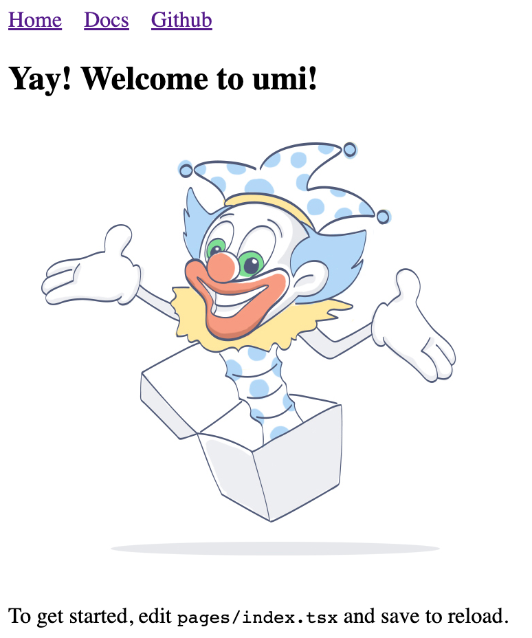
Click the URL in the command line to open the browser automatically. If successful, you will see the following interface:
We need to create a route to display a product list. First, create a route, which can be thought of as different pages in the application. Umi users generally don’t need to worry about the underlying implementation, but if you are curious, Umi’s routing is based on react-router@6.3 (Note: not the latest 6.4, as 6.4 includes loader and action features that Umi does not require).
Create a route using the following command:
$ npx umi g page productsWrite: src/pages/products.tsxWrite: src/pages/products.less
Then modify the configuration file .umirc.ts to add the new route declaration.
import { defineConfig } from "umi";export default defineConfig({routes: [{ path: "/", component: "index" },{ path: "/docs", component: "docs" },+ { path: "/products", component: "products" },],npmClient: "pnpm",});
Since the scaffold uses configuration-based routing by default, where routes are configured line by line, although cumbersome, it offers greater flexibility. This method requires adding routes to the configuration, as detailed in the Umi Routing Documentation. Additionally, Umi supports convention-based routing, where the file system represents the routes, so routes can work without configuration.
Edit the src/layouts/index.tsx file to add navigation to the /products path in the global layout.
<li><Link to="/docs">Docs</Link></li>+ <li>+ <Link to="/products">Products</Link>+ </li>
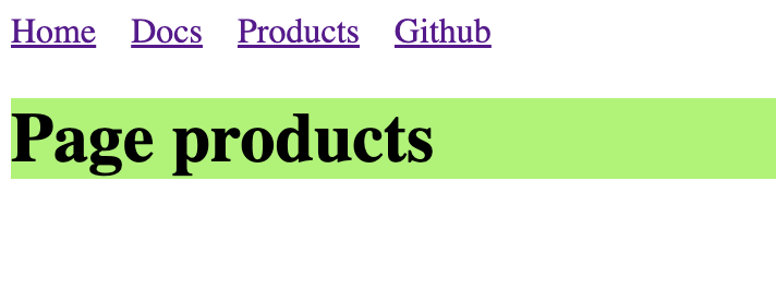
Open http://localhost:8000/products, and you should see the following page if successful.
As the application grows, you will need to share UI elements across multiple pages or use them multiple times on a page. In Umi, you can abstract this part into a component. Let’s create a ProductList component to display the product list in different places.
Create a new file src/components/ProductList.tsx with the following content.
import React from 'react';import {XProvider,Bubble,Sender,Conversations,Prompts,Suggestion,ThoughtChain,} from '@ant-design/x';import { Flex, Divider, Radio, Card, Typography } from 'antd';import type { ConfigProviderProps, GetProp } from 'antd';import {AlipayCircleOutlined,BulbOutlined,GithubOutlined,SmileOutlined,UserOutlined,} from '@ant-design/icons';export default () => {const [value, setValue] = React.useState('');const [direction, setDirection] =React.useState<GetProp<ConfigProviderProps, 'direction'>>('ltr');return (<><Flex gap={12} style={{ marginBottom: 16 }} align="center"><Typography.Text>Direction:</Typography.Text><Radio.Group value={direction} onChange={(e) => setDirection(e.target.value)}><Radio.Button value="ltr">LTR</Radio.Button><Radio.Button value="rtl">RTL</Radio.Button></Radio.Group></Flex><Card><XProvider direction={direction}><Flex style={{ height: 500 }} gap={12}><Conversationsstyle={{ width: 200 }}defaultActiveKey="1"items={[{key: '1',label: 'Conversation - 1',icon: <GithubOutlined />,},{key: '2',label: 'Conversation - 2',icon: <AlipayCircleOutlined />,},]}/><Divider type="vertical" style={{ height: '100%' }} /><Flex vertical style={{ flex: 1 }} gap={8}><Bubble.Liststyle={{ flex: 1 }}items={[{key: '1',placement: 'end',content: 'Hello Ant Design X!',avatar: { icon: <UserOutlined /> },},{key: '2',content: 'Hello World!',},]}/><Promptsitems={[{key: '1',icon: <BulbOutlined style={{ color: '#FFD700' }} />,label: 'Ignite Your Creativity',},{key: '2',icon: <SmileOutlined style={{ color: '#52C41A' }} />,label: 'Tell me a Joke',},]}/><Suggestion items={[{ label: 'Write a report', value: 'report' }]}>{({ onTrigger, onKeyDown }) => {return (<Sendervalue={value}onChange={(nextVal) => {if (nextVal === '/') {onTrigger();} else if (!nextVal) {onTrigger(false);}setValue(nextVal);}}onKeyDown={onKeyDown}placeholder='Type "/" to trigger suggestion'/>);}}</Suggestion></Flex></Flex><ThoughtChain /></XProvider></Card></>);};
Build the Application
After development and verifying in the development environment, you need to deploy it for users. Execute the following command:
$ npm run buildinfo - Umi v4.0.46✔ WebpackCompiled successfully in 5.31sinfo - File sizes after gzip:122.45 kB dist/umi.js575 B dist/src__pages__products.async.js312 B dist/src__pages__index.async.js291 B dist/layouts__index.async.js100 B dist/layouts__index.chunk.css55 B dist/src__pages__products.chunk.cssevent - Build index.html
The build process will package all resources, including JavaScript, CSS, web fonts, images, HTML, etc. You can find these files in the dist/ directory.
We have completed a simple application. You may have more questions, such as:
You can: